Before you move on to reading about the worst website designs and bad websites, ask yourself this. What do you think should get top priority when designing a website? Would you go for aesthetics over functionality?
Ask any web design expert and you’ll get pretty much the same answer. While the interface is important, functionality and user experience (UX) should get top billing. After all, web users prefer going through information that you present in a clean and logical manner. When it comes to building a brand online, the last thing you need is bad website design.
Unfortunately, designing a website that is functional as well as good to look at is easier said than done. Going through bad website designs gives you an indication of the mistakes you need to avoid in designing your own website. Here are some of the worst websites that are still around.
Table Of Contents
1. User Inyerface
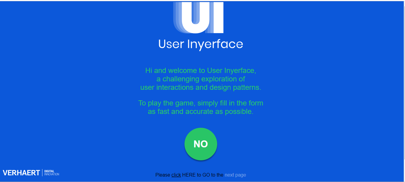
The creators of User Inyerface have used bad website design intentionally, mainly to highlight some of the worst website designs you might come across. This game-based website highlights how much web users rely on conventional web design to interact with the internet.
You cannot click buttons on the website, the drop-down menus are not sorted correctly, and even getting past the homepage might seem like a challenge. You do, after all, have to click on the completely un-highlighted “HERE” to move to the next page. This, in itself, can make it to the list of the worst website design games. One popup window even causes the website to close automatically if you don’t get the instructions right.
The website’s CAPTCHA aims to take confusion to the next level. Get this – you might have to click on all images that have “bows”. However, the images you see could include a type of necktie that people wear and weapons that archers use.
With its uniquely clever yet twisted design, User Inyerface shows that even seemingly small glitches in web design can lead to rather poorly designed websites.
Looking to Boost Your Business Online?Request a Quote
2. Arngren
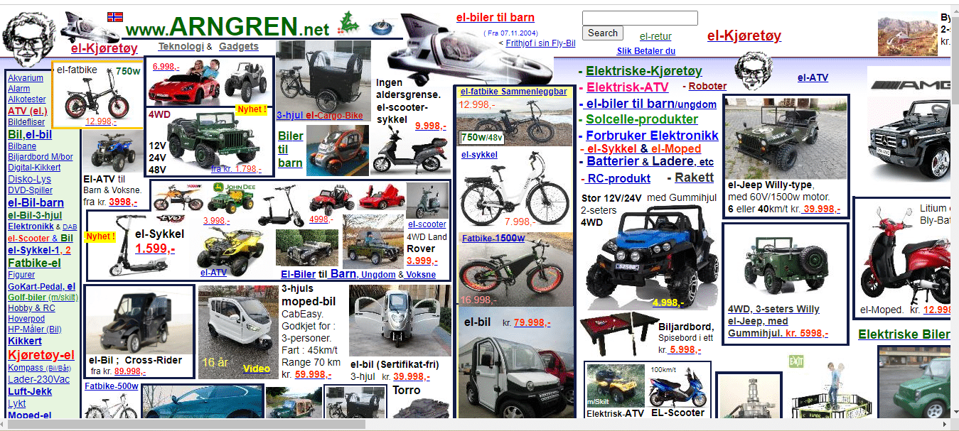
If there was an award for the worst website ever, it’d probably go to Arngren. By the looks of it, this classified website from Norway pays little regard to the basics of web design. It seems like it takes inspiration from the Yellow Pages, where cramped advertisements fight for space.
The team that has worked on Arngren’s website design offers little more than a puddle of mess when it comes to hierarchy. While the devil usually lies in the details, you’ll see that Arngren suffers poorly on account of perspective, alignment, spacing, and even size.
Other reasons that put Arngren on several lists of the worst-designed websites include poor navigation, random and incorrect use of colors, confusing and very small typography, and no clear message about the company.
3. Berkshire Hathaway
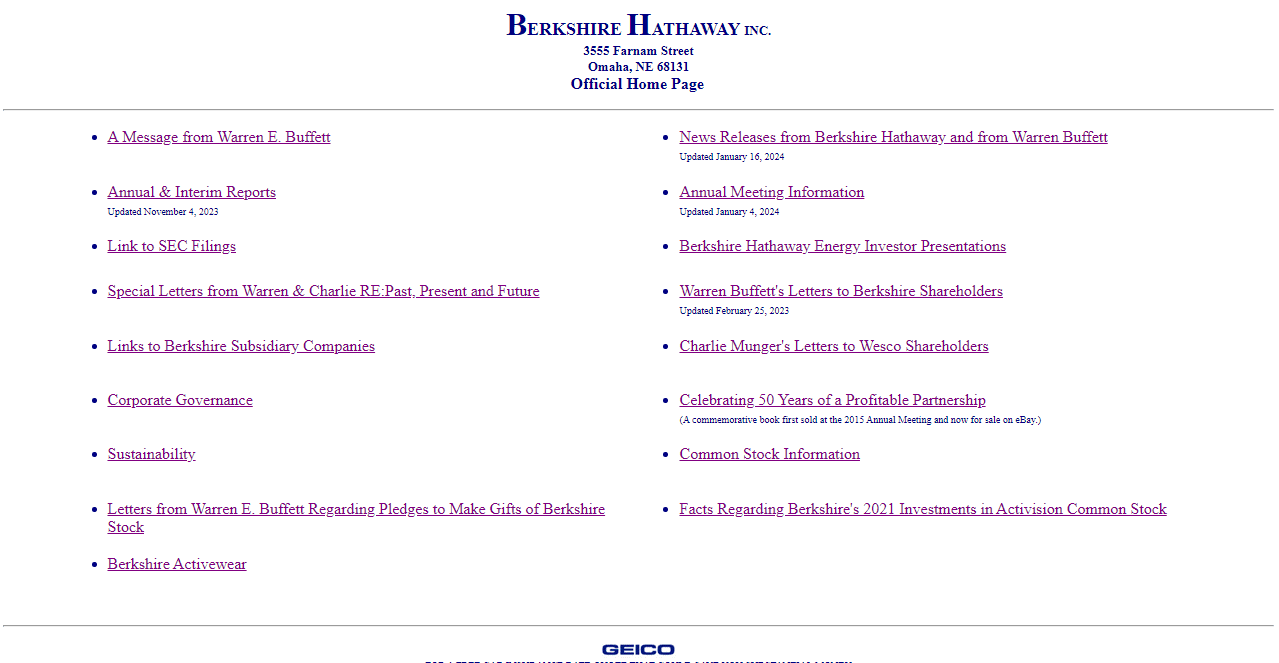
Berkshire Hathaway is a fairly popular company, and with Warren Buffett at the helm, one would expect better from its website. The website remains devoid of any visual appeal, simply providing links to other pages. Besides, you have to go through pretty much all the content to find the information you seek. Upon clicking any of the links on the homepage, the page you land on is no different. For example, if you click on “Links to Berkshire Subsidiary Companies”, you get to a page that just lists all the companies. Fortunately, the design team has arranged this list alphabetically.
4. Pacific Northwest X-Ray Inc.
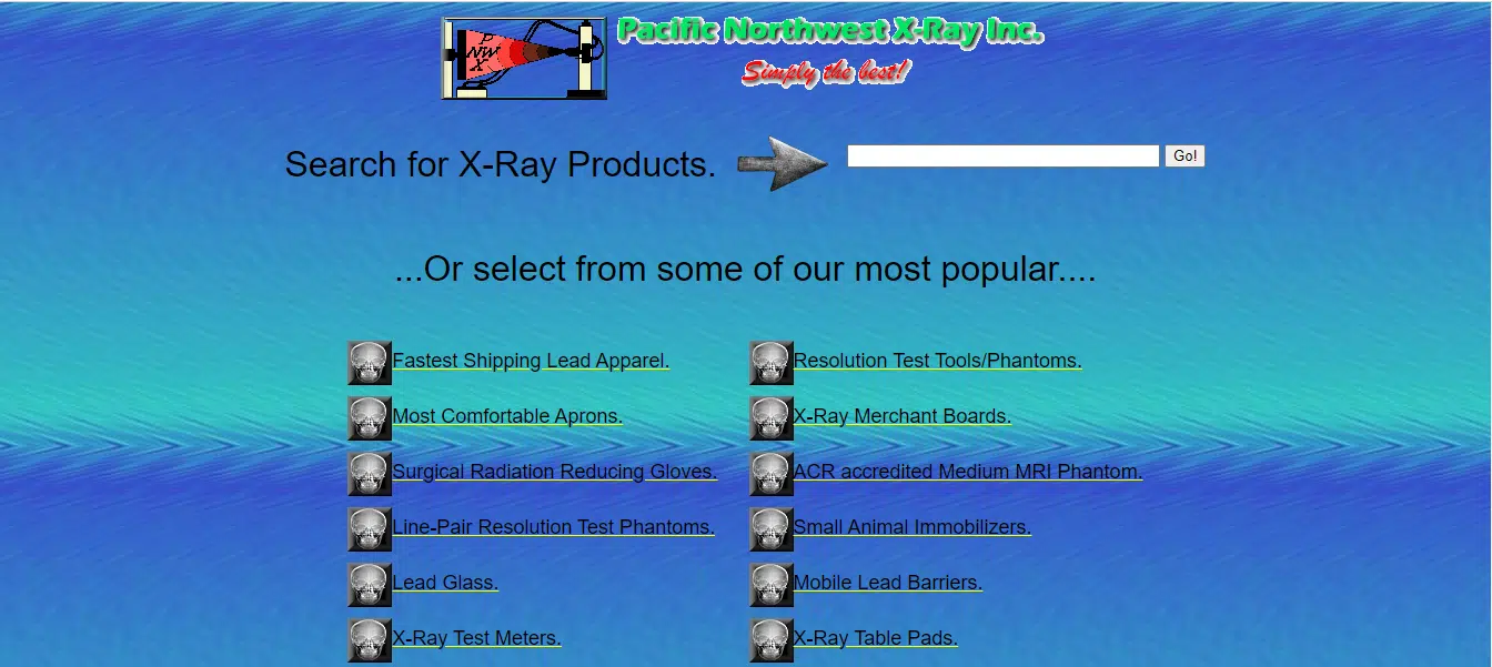
This company deals in X-Ray related equipment, accessories, parts, and supplies. It claims to be “simply the best”, although it is clear that it’s not the case when it comes to web design. While you find navigational elements at the center of the homepage, they do not follow any logical flow and look cluttered.
Given the lack of definition, getting users to focus on the website’s call to action (CTA) buttons is an obvious challenge. The absence of a mobile-friendly or responsive interface is a definite drawback, seeing how many people use smartphones to surf the web. No use of HTTPS leaves users feeling vulnerable when it comes to the safety of their data.
Other aspects that go to show the bad website design used by Pacific Northwest X-Ray include the use of nearly obsolete Flash-based elements, poor use of colors, hard-to-read typography, and the absence of suitable white space.
5. Yale University School of Art
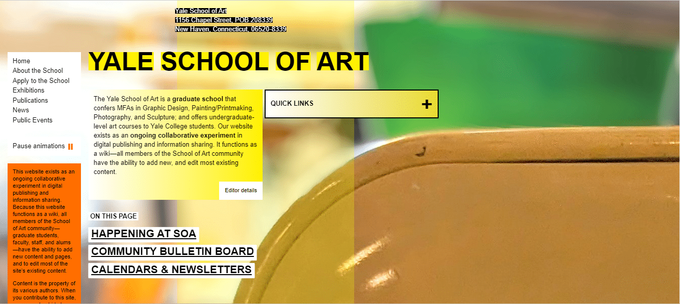
When you think of Yale University, expecting great results in just about every aspect the university covers is natural. Surprisingly, the Yale University School of Art makes the cut when it comes to terrible websites. If the designers were trying to create something extraordinary, they did, but not in a good way.
Using Ruby on Rails, faculty and students of the university are mainly responsible for the website’s programming and its upkeep. The background on the homepage is nondescript at best and the artwork seems amateurish. Popup animated backgrounds found on some of the website’s inner pages seem to be placed in a hurry, with no regard to aesthetics.
A blast of bright colors from boxed text makes for unpleasant viewing and reading. In some cases, as with the contact information right on top of the homepage, the text may well have been larger, and more suitably positioned. When you view the website using large screens, make away for a lot of unnecessary white space.
What probably works in favor of the website to some degree is its simple navigation. Oh, and good luck finding the “Pause Animation” button.
If the university thinks it can get away with anything in the name of art, it might need a reality check, or the critics of its website might need a class in art. Until then, this website will remain on several lists of bad website designs.
6. Suzanne Collins Books
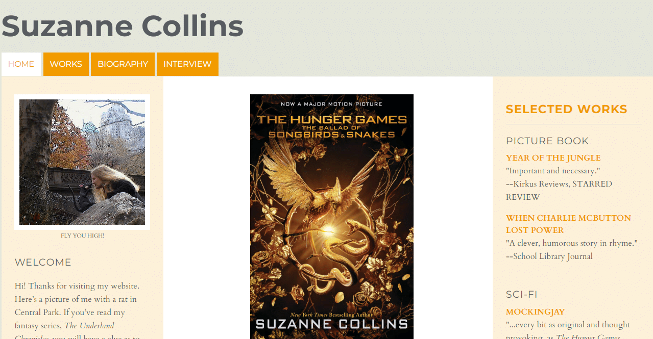
Known primarily for having written The Hunger Games trilogy and The Underland Chronicles, Suzanne Collins, an American television writer and author, has fans in different parts of the world. However, they are obviously in for disappointment if they expect the official Suzanne Collins Books website to use eye-catching graphics or futuristic design. What you get instead, is a great example of websites with bad design.
Disappointment begins right at the homepage, where you find a layout that looks like it’s from the 1990s. Scroll down and you will be surprised at the amount of white space that appears for absolutely no logical reason. In between all the white space, you find images of the author’s books, with very little information, and no links you can click to find out more.
When it comes to book-specific pages, they continue with the pattern of providing little to no information. All that the pages offer are lists of awards and reviews. Neither can readers find out what the books are about through descriptions, nor where to specifically buy them. All the website does is point readers in the direction of homepages of websites such as Amazon.com, Books-a-Million, and Barnes & Noble.
Looking To Boost Your eCommerce Business Online?Request a Quote
One good thing about this website is that it has transitioned from HTTP to HTTPS. With over 100 million copies sold, why the author could not do better with her website continues to surprise many. Maybe she’s after the not-at-all coveted world’s worst website award.
7. Great Dreams

You might find the Great Dreams website trippy if you’ve popped in some LSD, but you can’t be sure of that. Haphazard use of colors from “That 70s Show” and an almost un-ending homepage might make you wonder how great a dream the website owner may have to offer.
Scrolling down the page leads to the central portion attaining different widths, with an unpleasing increase or decrease in the use of empty space. Font colors and sizes keep changing with no regard for user experience, with some textual portions even appearing in irritating 3D formats. At some point soon enough, you might think of abandoning the website.
Finding information on this website that does not rely on any particular theme is quite a chore, with the designer giving navigation no attention whatsoever. While the website owner might wish to appear as a master of all things dreamy, wishful, or apocalyptic, all you get is a crazy mishmash of information
Toward the end of the homepage, you get to read that “This site was featured in the CIRCUITS section of the New York Times newspaper on October 1, 1998 and December 21, 2000.” You will not be far off the mark to imagine that its last update took place around the same time too. For as long as the designers and developers of this website do not take remedial measures, it will continue to fight for the title of the worst website ever.
How to Avoid Horrible Website Designs?
While there is no single worst website design template you need to avoid, there are a few red flags that need your attention. Not taking these factors into account simply leads to the creation of poorly designed websites.
Branding
You get just a few seconds after your website loads before a user decides to stick around or move to the next alternative. While your web design might leave little room for improvement, if users are unable to make quick decisions about your website, you stand little chance.
When your website’s design uses branding in the right way, users get to know what your business is about, its offerings, and how they stand to gain. The benefits of effective branding include easy brand recognition, customer loyalty, and increased credibility.
Colors
Colors play a crucial role in web design. If you look at some of the worst websites out there, you will notice that many get their colors and color combinations wrong. What web designers need to acknowledge is that they can use colors as powerful tools when it comes to getting desired reactions from web users. For instance, designers often use specific colors to generate emotions or to direct people toward call-to-action buttons.
Colors give people the ability to process and store information more efficiently when compared to black and white. You can use this knowledge to increase brand recognition and to present your offerings in the right manner. Bear in mind that colors may have subconscious effects, so it is important not to use ones that go against your brand’s philosophy or values.
Mobile-Friendly
Not creating a mobile-friendly or responsive website in this day and age is a big mistake. Stats from different sources indicate that the possibility of people making purchases through websites they cannot view properly on mobile devices reduces significantly. Other than boosting sales, responsive web design also results in effective use of content, making a website faster, making it more Google-friendly, and improving overall user experience.
Looking to Grow Your Brand Online?Request a Quote
User Experience
User experience (UX) is a broadly used term that touches upon aspects such as a website’s accessibility, design, usability, performance, layout, and utility. It also accounts for human interaction and marketing. Web designers need to pay due attention to delivering great user experiences by taking into account how users interact with your website based on factors such as behavior, perception, action, and satisfaction.
Consider these UX statistics collated by Baymard Institute.
- 40% of users leave websites that take over three seconds to load
- 88% of consumers are less likely to use websites that deliver poor experiences again
- 90% of users stop using apps that perform poorly
- 32% of consumers stop using brands they like after just one poor experience
Conclusion
When it comes to the worst website design ever, the ones that vie for the top spot tend to have some commonalities. Unmindful or brazen use of colors is right up there because no one likes to get a headache. If users cannot tell what your business does or how it operates, your website has little chance of success. Use of very small text or fonts that are hard to read make for unpleasant experiences, so make all your textual content as easy to read as possible.
If you can manage to deliver a good user experience to people who visit your website, you will, without a doubt, have a winner on your hands. If you feel you don’t have the required expertise, partnering with a professional web design company is the obvious way to go.