Trends are the well-known changes that take part in creative fields and web design is not an exception. Trends have been the fuel behind changes and are born of innovation and experimentation aimed at pushing industries forward. The World Wide Web is a special environment where change is constant and things are always evolving. Keeping up with the latest web design trends, as a result, needs to be part and parcel of any web designer.
Good web designers make sure they remain up to date with the latest trends because this field continues to evolve rapidly. For instance, some trends may become obsolete in the next two to three years. One of the most significant changes that have happened in recent times is the noticeable shift toward adopting a more systematic approach, given that there’s been a surge in the focus on user experience (UX) design. Web design, after all, is no longer about just building pages, it involves building complex systems.
Here are the top web design trends you need to be aware of, either as a website owner or a web designer.

Table Of Contents
1. Personal Branding
Whether you pay attention to it or not, personal branding is here to stay. How people perceive you and your identity are two different things. The reason why personal branding is important is to ensure that you align your mission and vision in a way that people perceive you as you want to be perceived rather than letting them speculate.
Without personal branding, your audience will have different opinions about you, and not everyone will think of you as you want them to perceive you. By paying attention to this aspect, you get the control you need to tell people who you are through your website.
2. Mobile-First Approach
If you want to succeed in your industry, you need to pay close attention to statistics, especially when it comes to accessing the internet. The world has gone digital and this means that more people are finding businesses online. Besides, they use different devices to find products and services. According to numbers released by Statista, more than 50% of the world’s web users use mobile devices to get online.
A website that’s not mobile-friendly is a great hindrance to people using mobile devices. Experience is everything when it comes to users and the internet. If users don’t like how a website appears on their small screens, they will find one that looks attractive. It might not be of the same quality as the one they have left but it looks good to them and that is all that matters.
Since mobile phones come with screens smaller than computers and tablets, and the mobile-first design dictates that the designing process starts with these small devices, websites might have to get rid of unnecessary content. Now, more than ever, it’s crucial to prioritize smaller screens instead of taking them as secondary elements.
3. Improved Responsive Design Implementation
If you have no idea about responsive web design, here’s putting it simply. It refers to a process that creates websites with the aim of providing a good user experience no matter what device someone might use. It involves using flexible grids or layouts and CSS media queries.
Responsive web design results in a dynamic website that will adjust the content automatically based on the device in question. It works closely with the mobile-first approach because both aim at improving the experience of users regardless of which device they use. Another reason most brands want to go the responsive design path is that Google and other search engines favor responsive websites over non-responsive ones.
Looking to Grow Your eCommerce Revenue?Request a Quote
4. Modular Design at the Forefront
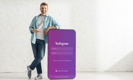
Modular, also referred to as grid-based design, might not be new but it has made it to the list of the biggest web design trends with good reason. This trend started gaining popularity because of its reusable nature and the fact that it is responsive with tiles stacking well on different screens. Layouts are flexible and look clean and presentable on any screen size. Some of the best examples of websites that successfully use modular design include Instagram and Pinterest.
5. Use of Asymmetric Layouts
Until not so long ago, designers looked at symmetry as the most suitable way of designing websites. They use grid systems that focused primarily on preset alignments. Different elements usually followed a particular hierarchy. The evolution of grid systems brought to the fore an inclination toward asymmetry.
While the idea of a scattered layout is not new, not many designers have given it a go yet. The reason this is among the top website trends is it offers designers the creative freedom to play around with their vision, content distribution, and typography integration. With designers getting increasingly proficient, expect more websites with asymmetric layouts to arrive soon.
6. Single Page Web Design
Web browsing patterns are changing and it seems like scrolling is winning over clicking. The use of mobile devices is on the rise and this is significantly changing the design of websites. With smaller screens and scrolling being an easier option, most users prefer not to click and wait for a link to open. They’d rather scroll around using their fingers on the touch screens. One-page sites present a lot of information on one page. They started getting popular a while ago but they make much more sense today.

7. Focus on Imagery
Including imagery in the form of photos or graphics is a crucial aspect of modern-day website design. New website trends indicate that designers need to pay special attention to using unique imagery. Images become especially important for eCommerce sites. According to a post on Medium, around 75% of consumers make purchase decisions based on product photos.
The use of stock photography is on its way out, and designers are now striving to create authentic experiences through custom photography and graphics that may also include sketch art. Line art icons are finding their way into a number of websites, mainly because they score over stock alternatives in creating complex images.
Use of Authentic and Fresh Imagery
Stock photos played a major part in the world of digital communication until not so long ago. Be it a blog, an eCommerce website, or a portfolio, stock photos found their way to scores of websites.
The use of images aims to engage users and make it easy for them to understand what the website is trying to communicate. Sites have been using the same old stock photos with smiling people, rivers, mountains, and whatnot. Now, thanks to innovative web design, designers use more realistic and relatable images.
It’s important to understand that users are always looking for authenticity and stock images no longer make the cut. Brands will need to portray visuals and content that explain who they are to create a difference between them and their competitors. Brands need to adopt bespoke illustrations, attractive typography, and original photography. Users are tired of seeing the same businessmen smiling on every website they come across, and brands need to look for different ways to make sure their websites look unique.
Websites like Picjumbo and Unsplash have contributed a great deal to the use of appealing photos that do not look like the same old stock images which web users find all too familiar.
Looking to Boost Your Business Online?Request a Quote
Scalable Vector Graphics
Scalable Vector Graphics (SVGs) are set to overtake traditional file formats such as JPEG, GIF, and PNG. Unlike the traditional formats that rely on pixels, SVGs are essentially a combination of lines. SVGs are scalable, which makes them perfect for responsive websites that are accessed using devices with different screen sizes.
There is no distortion when users zoom in on vector images. Designers who want images to remain resolution-independent will move toward SVGs, no doubt. Besides, SVGs are required for newer experiences such as 3D images, cinemagraphs, and 360 degree-views.
Cinemagraphs
Among the top web design trends is the use of cinemagraphs. If you’re wondering, “What are cinemagraphs?” know that they are basically a combination of static images and full-blown videos. However, they take considerably lesser time to load than conventional videos.
You may think of a cinemagraph as a snippet that creates dynamic images without affecting how quickly a website loads. You’ll probably be surprised to learn that several animated movies you’ve seen are nothing more than pictures in motion.
8. Use of Video Background
A website is a form of storytelling tool and telling a story is more effective with motion and visuals. The visitor will understand the content better when there are emotions and ideas transferred through motion. Scores of businesses use videos on their websites, and this trend is growing bigger.
Now, there are possibilities for 3D graphics and high-definition videos. This helps build a real-life impression that improves a user’s experience. Statistics indicate that people love videos, which explains why web designers are leaning on their side. With people watching over one billion hours of video on YouTube every day, this number is hard to ignore.
YouTube is continuously growing popular and overtaking conventional TV. This is because it gives people the freedom of choosing what they want to watch and when. It makes sense to include this popular trend in web design to maximize your website’s potential. However, a possible drawback comes in the form of a longer loading time.

9. Relying on Animation
As languages and browsers advance, there is an emerging trend of websites using animation instead of traditional static images. Personality and a story-telling approach are what brands are going for in an effort to capture the attention of users. Animation, courtesy of jQuery, CSS, and HTML5 is playing a major role in this process.
Animation comes in different sizes and styles, and its flexibility makes it a popular method of communication. These can range from small animations used to entertain users as a web page loads to more interesting features that come to life when users hover over links or images.
It is possible to employ animation on a large scale to create videos that function as the center of attention on a website. Several brands are already looking at different ways they can use animation to their advantage and attract users to their sites.
Websites of the future will see an increased use of animation, be it in logos, applications, icons, or transitions. A website becomes more attractive and dramatic with the right use of animation. Besides, its use may help attract more customers and increase the time they spend on a website.
10. Use of Rapid Prototyping Tools
While not a part of web design, per se, these tools are, without a doubt, some of the most useful ones to enter the world of web design in recent times. Besides, they include some very important tools that user interface (UI), user experiences (UX), and web designers should have in their arsenal.
Services that provide rapid prototyping such as Marvel, Invision, Webflow, and UXpin allow designers to create high and low site and service prototypes to check aesthetics and usability. This is without the need of writing any code. These tools can allow a designer to create a site on the browser and launch it from the tool.
These changes might help get rid of static mock-ups and wireframes designers use to explain the process. Clients will have a chance to see exactly how the system looks and how it works without the need for a long conversation that will end up confusing them. In times to come, more businesses might turn to using these tools for improved efficiency and streamlined workflows.
11. Shifting to UI Patterns and Frameworks
The responsive and mobile-first approach in the web design world and the popularity of WordPress have had a significant impact on how modern-day desktop sites look and function. You can see an increased use of the UX and UI patterns emerging across the web with many sites working and looking alike. They are simply learning from each other to improve the user‘s experience.
Now, websites are becoming consistently friendly. There is a lot of competition today and brands in different industries cannot afford to take a risk that will see then fall behind. It is fair to predict that the current UX and UI patterns will evolve and develop further. Going forward, more businesses will wake up to UI design trends and implement them with the aim of providing great user experiences.
Looking to Create a Marketing Strategy?Request a Quote
12. Going for Courageous Colors
One of the newest web design trends is the use of rich colors. Over the past few years, web designers have been using what one may refer to as safe colors. More and more brands are diving into braver colors that are out of the conventional list. You may expect many new websites on the block to come in vibrant hues and colors that would normally not find their way on traditional sites. The use of bold colors is not without reason, though. Using such colors can greatly help in the attraction of the user’s attention.
A good example is Spotify which has moved from a mellow green color to a more vivid hue that is noticeable. Brands will also move towards using braver colors within their brand and identity with the hope of getting more attention from users in their target group
13. Use of Creative Scrolling
Scrolling has helped people move from the top to the bottom of web pages for a long time. Today, it scrolling can happen in more innovative ways to augment the delivery of content. Since users view a website’s content on different screens, its delivery is very important. For example, if a video is playing, scrolling down should ideally pause it. In addition, previously static content animated now needs to adapt to scrolling.
14. Using Negative Space to Better Effect
White space within websites is as old as the internet itself. However, website and mobile app design trends indicate that designers are working around this aspect and finding better use of negative space than before.
Quick-to-load lightweight pages are particularly important given the widespread use of smartphones. Designers no longer focus on flashy designs and the primary focus is now on increasing conversion. Visuals that make their way into existing negative space are not there just to improve aesthetics; they provide valuable insight into products and services on offer.

15. Using Customized Typography
Asymmetric layouts have had an effect in the realm of typography too. Commonly used sans serif fonts have made way for unusual typefaces that include big, bold, and even hand-crafted lettering. While large fonts are effective in conveying information, they may also serve as visual cues.
One can expect the best website designs of the future to use contrasting typefaces and different font families, which has become possible mainly because of compatibility between web-based fonts.
16. Thinking Minimalism
Minimalism makes it to the list of top web design trends because it deals with an important aspect – users’ patience. Ideally, a website should take no more than two seconds to load. If it takes longer, prepare to lose a fair share of customers. In the coming years, designers need to make a conscious effort to reduce the number of HTTP requests and on-page elements.
17. Making Use of UX Writing
The main UX factors previously considered were limited to elements surrounding visual interface and graphics, and textual content typically took a back seat. Fortunately, modern UX design trends take into account that while visual elements aid in comprehension on the surface level, getting an in-depth understanding requires a shift in paradigm. Words design, or UX writing, will be an important factor in the coming times, and it will not be long before chatbots start doing the needful.
Besides, most web design experts expect content marketing to go a notch higher and brands will need to find creative ways that will help get their content to users in the most effective manner.
Conclusion
Web designers and website owners need to start gearing up for the road ahead, given that the newest web design trends will require some learning. However, it is important that you do not follow trends blindly, because not all websites come with the same requirements. If you’re unsure about how to proceed or would like to get professional advice, getting in touch with an experienced web design agency might be the way forward.


